Friday, July 24, 2020

Exponential Growth - It's Happening and It's Not Pretty

<Revision - 7/25 - adding JH chart and remarks about exponentials and explosions>

On March 26th of this lovely 2020, I offered a simple visually oriented discussion about exponential growth:   "Glass Half Empty", in which I emphasized the dangerously deceptive "early growth" phase of any exponential process.    If a glass takes a minute - exactly 60 seconds - to become half  full of a magical liquid which was deposited in a small amount at the beginning of the process and DOUBLES IN VOLUME each second, you CAN'T SEE IT until less than 10 seconds before the glass is half full.   Then, a second later, the glass is FULL.   If you wait a few minutes, the house will be flooded, and possibly the neighborhood.

That's exponential growth. 

Most humans lack opportunities to develop an intuitive feel for that kind of rapid increase.   The wealthy are very profitably aware of the notion of COMPOUND INTEREST.   That's exponential growth for you.   Doubling rates are typically measured in YEARS, not days.   But a wealthy family that invests wisely over multiple generations will rise to that top 1% of the World's Wealthiest Families simply by riding exponential growth.

As discussed on Facebook with a friend from grad school years, nuclear explosions also tend to be exponential processes, although those initial "quiet doubling periods" happen far to quickly to be perceived without very high-speed cameras.   The Wikipedia page on exponential growth features a video of exponential (approximately) growth of a colony of bacteria.   Again: things appear to start out slowly.   At some time, the growth (viewed in real time - as opposed to charted on a log scale) appears explosive.

So:  How did we get from 15 proven cases of COVID19 in early 2020 in the USA to well over 100,000 deaths today (July 24th, 2020), over 4 *million* positive tests, and over 600,000 dead worldwide?   A year ago, nobody had even HEARD of this disease. 

This chart is from the impressive collection maintained by the Johns Hopkins University.   You can find a link (updated to whenever you view it) here.  By using the tools on the interactive chart, you can read the value at any point on the curve.   What the chart documents, in addition to the USA being Number One (as we seem to always love), is that Brazil threatens to overtake the US.   My two "home" countries...    ALSO:   although the doubling rate has slowed - in both countries - from a time interval of UNDER a week to current rates closer to 6 weeks, we're still climbing in a roughly exponential manner.   Note the vertical scale: increments are multiples of ten of the reference line below them.    This kind of growth would bring the USA to roughly 32 million cases within three more doubling cycles - before Christmas.   The same rough estimate would bring total deaths (currently at about 146 thousand in the usa) to 1.2 MILLION in the USA.    Compare that to pretty much any war in which the US has been involved.   This is serious.  And it's global (for Brazil, projections are nastier).

This screenshot is from the same chart URL referenced above, where I used one of the interactive controls to switch from "cases" to "deaths".


Pandemics spread exponentially.    Stopping COVID19 is NOT trivial. 

In April (the 13th, of the 2020 "Year of Covid") I shared some thoughts about face coverings:  "Why bother wearing cloth masks?".   Back in mid-April, I don't recall this having been a politically polarized or ideologically controversial issue.   It was easy to focus on the obvious facts regarding what we knew - even in mid-April - about the transmission mechanism, and what was known about droplets exhaled by potential carriers and how fabric can stop MOST of those droplets. 

Since then, it is absolutely mind-boggling to see how this issue has become a hill on which many science-denying humans are willing to fight a battle to the death - quite literally.   As my brother mentioned in a Facebook post, "not wearing a mask might make you feel wonderfully free, but it's like the so-called freedom to drive at 60 miles an hour through a neighborhood.  Sooner or later, somebody is going to get killed".   Sorry, Kent, if I paraphrased that inaccurately.

In May, as news outlets began worrying about a "second wave" and many were skeptical about the need for further caution given that "we've passed our peak", I offered a discussion I called "Flatten Which Curve?".    Main point:   there are multiple curves we are monitoring: total infections in any given geographical region;   total deaths attributed by healthworkers to COVID19;   as well as NEW cases, NEW deaths, available hospital beds, number of people CURRENTLY hospitalized... One remark in the concluding section was "New infections could spike dozens of times if we continue to change our behavior."  But now - because of exponential growth of impacted humans - we're rapidly approaching a million deaths worldwide, four million infections in the USA,  and well over 100,000 deaths in the USA.    Remember, four moths ago we were still below or near a hundred deaths.  If this continues, it's not a linear process:  we won't add another 100 thousand in four months.   The math would say we'd add  another thousand-fold.   That would take us to a third of the US population, which we don't really expect to happen.   But that's the math.  Exponential, not linear!

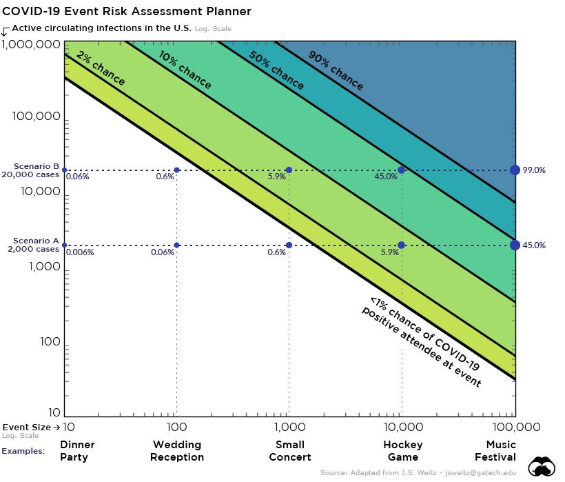
In June, a fantastic chart was shared and discussed.   It's a simplistic but suitably exponential model for the likelihood of catching COVID19 at a gathering.   One axis shows the size of the gathering (how many people?).  Thee other axis shows just how bad the pandemic is in a country (US, in this case).   Sadly, once this particular post was made public, the US was deeply divided over strongly politicized interpretations of ANY fact related to the pandemic.   George Floyd had died under a Minneapolis policeman's knee.   Protests erupted all over the country AND the planet.   And the clouds of tear gas faced by certain protesters are a great metaphor for the smoke that has confounded the public's ability to remain rational and reasonable about COVID19.   Instead of addressing the disease and its spread, folks prefer to accuse their political opponents of not behaving properly regarding the required behavior for minimizing the spread of the disease.

We have over five months left in 2020.

Five months during which the pandemic could easily devastate countless millions of families, particularly in the most impoverished, vulnerable communities worldwide.   Some of us fret and whine about being confined to our homes, or being required by authorities to wear a mask.   Maybe we wash our hands.  Maybe we maintain 2 meters of separation whenever and wherever possible from others.

For billions of humans, if a home exists in which to "shelter in place", it is shared with ten or more others.   Water is not available.   Savings or publicly provided resources for staying alive... also are lacking.   

The virus isn't going to disappear.   But my actions, and yours:  they will determine how rapidly COVID19 continues to spread, and just who will be added to the grim total number of deaths caused by that particular coronavirus.

Stay safe.  Stay healthy.   Think critically. 


Saturday, June 20, 2020

Two-variable model for risk of catching COVID19 virus at a gathering

A very useful graph has been published by a website called Nation and State.    Here's the link.


Do you love graphs?   This one speaks for itself and is very timely.   Hate graphs?   Let's walk through this one carefully. 

The graph describes the probability of an attendee at an event getting infected with the particular Coronavirus causing the COVID-19 pandemic.    That risk is described the the color of the different "zones" on the chart.   White is safe (lower left-hand corner).   Dark blue is dangerous (upper right hand corner).   

Two variables are used in the model.   The first, shown on the vertical scale, is the number of ACTIVE INFECTIONS in the entire USA.    The second, on the horizontal scale, is the NUMBER OF INDIVIDUALS AT AN EVENT. 

NOTE:  these are what we call "logarithmic scales".   Moving along this kind of scale by equal distances "on paper" or "on your screen" does not change the variables by equal increments.   Instead, it changes the variable by equal multiplicative factors.   Note the numeric labels at equally spaaced distances.   Each is larger than the previous by a factor of ten: 10,  100, 1000, 10000, 100000...   These scales are of vital importance when discussing phenomena for which variables range from small numbers to extremely large ones (simply stated). 

Let's examine the four corners initially.   Lower left:  very small number of infections nationwide, very small gathering.   You are safe at this gathering, very unlikely to get infected. 

Opposite corner:   very large number of infections (although scale only goes to 1 Million, or 0.3% of all americans), and a very large gathering (scale goes to 100 thousand).    Your chances of getting infected are well over 90%.

Other corners: upper left - country has lots of infections, but gathering is very small.   The risk is above 2%.    Lower right:  very large gathering, but low number of infections in the USA - you're quite safe. 

What's NOT present in the model used to generate this graph:  A LOT.    Is social distancing used?  Are attendees wearing masks?   What kind of masks?   Have they been screened prior to attending?   Is this an open air event, or is it in an enclosed space?   If in an enclosed space, what sort of air circulation and filtration system is present?   How long does the gathering last?   Are individuals wandering about, mingling, spending many seconds (minutes?) in contact with lots of other attendees, or are they stationary most of the time, surrounded by a small number of individuals (as in...  airplanes)?   During entry, waiting, and exit: are there packed, dense crowds? 

If you're still with me, let's agree on a conclusion or two.   (a) if you attend a large gathering, TRY to improve your chances and those of people around you (in case you are an asymptomatic carrier) by wearing a mask and striving to maintain social distance. (b) When evaluating or even speculating about whether events have caused infections, keep the chart in mind - and remember the factors EXCLUDED from the chart that will alter actual probabilities.   (c) If I was able to locate this information, then it seems likely that experts in the Trump campaign also have access to this.   We're not talking about a loosely organized blend of diverse protesters.   This is the President of "The World's Most Powerful Country", surrounded by "The finest and brightest experts in the world" (?!?).

Context: I am posting this blog entry the day after Juneteenth, 2020.   We've watched as certain countries have endured enormously different levels of infections as the COVID-19 pandemic spreads.  Experts have repeatedly stated that these different outcomes reflect, among other factors, the response determined by authorities.

We have also, in the USA, been experiencing the most widespread, most visible, vocal and widespread series of protests against systemic racism and systemic violence in many decades.   Amidst all this, President Trump has scheduled his first campaign rally in three and a half months for Tulsa, Oklahoma.  Originally scheduled to take place on "Juneteenth", the holiday celebrating the de-facto liberation of the final population of slaves remaining three years after their legal emancipation, Trump agreed to change the date - by 24 hours.   Tulsa is the city in which, 99 years ago, the United States witnessed the most horrific act of domestic terror on record.   An attack using bombs dropped from civilian airplanes, killing hundreds, destroying millions of dollars worth of property, leaving 8,000 black americans homeless.   6,000 of those were then interned in (essentially) prison camps. 

These words are being typed 2.5 hours before the rally begins.   History will determine the ultimate significance.   This blog entry documents the fact that this rally is being held despite the very well documented risk of triggering thousands of new COVID-19 infections, particularly given the tightly packed crowd which are somewhat likely to follow their leader's example by not wearing masks.

Tuesday, May 26, 2020

Flatten which curve?

Nearly ten weeks have passed since the Washington Post shared the outstanding simulation illustrating the spread of a virus in a population.   Nearly all of us have at least heard the phrase:  "Flatten the Curve".   It's even a hashtag now, which we'll use: #FlattenTheCurve.

Collective behavior over Memorial Day Weekend in the USA suggests that millions of US citizens never got the memo.

Perhaps it's because there is a great deal of data, and there are multiple "curves" being shown by the media (and researchers).   This is inevitable when discussing non-trivial physical, biological, economic, or social phenomena.

We use plots to represent not only the total number of infections documented to date (positive tests, total), but the CURRENT number of active infections (original curve to be flattened in the simulation and in multiple other graphs), the daily count of new cases, the daily death count, and the total cumulative death count.

The total number of infections would flatten all by itself: no social distancing, no mitigation.   It would flatten because the world has a limited population.  Sooner or later, the virus will run out of people to infect.   The *WRONG* curve will flatten, after our health systems have collapsed and the economy is damaged almost beyond repair.

NEW CASES or ACTIVE CASES or even FATALITIES:  those are curves we want to flatten at the lowest possible level. 

Why does it matter, if "we already had and passed our peak", if hundreds of people crowd into small spaces with no personal protective equipment? 

Any flattening obtained to date can lead to either (a) the desired result, with the number of active cases continuing to decrease and eventually approach zero; or (b) a disastrous resurgence of exponential increase in new cases - and deaths.

Option (b) has always been lurking in the shadows.   Not even the most pessimistic reports would suggest that more than 2 or 3% of the US population has been infected with the novel coronovirus.   Even if that number were 10%, we would still have THREE HUNDRED MILLION vulnerable humans.   Individuals who will catch the virus and develop COVID-19 if exposure results in a sufficient viral load to be transferred.

Now is not the time to allow math anxiety to trigger disregard for what experts keep telling us.   New infections could spike dozens of times if we continue to change our behavior.   Just hiccups in the rate of increase of total cumulative infections if our healthcare system collapses and we proceed to march towards that situation where, within a year, every american has either survived COVID-19 or died from it.

Don't become a statistic - a new infection. #FlattenTheCurve.  The right one.

Monday, April 13, 2020

Why bother wearing cloth masks?

In a recent online discussion about home-made cloth masks for Health Care workers, somebody asked  "Why do they (nurses) bother wearing them?  I thought the masks won't protect them." 

My response:  Here's another way of thinking of it.   In healthcare locations we have a situation that is comparable to neighborhood parks, streets, and certainly supermarkets.   Many people moving around in a limited space.  More opportunities for droplets generated by speaking (yes!), coughing or sneezing to get INHALED by another person - the primary contagion mechanism.   More opportunities for droplets landing on surfaces where somebody will touch them (or the dried residue) and get "material" on their hands or gloves.   

Wearing masks in non-COVID19 areas of a hospital, including receptionists or folks working at a desk, helps reduce the likelihood of workplace contagion.    That's why authorities have finally agreed on having everybody wear cloth masks (speaking now of non HC workers, the general population).   

I don't believe I have COVID-19, but I do not know.  

I could have it and be in the pre-symptom incubation period.  Maybe I have the disease, but am asymptomatic.   Regardless of having COVID-19, if I am out  in public and "innocently sneeze" as so many of us have done all our lives - long before COVID19, I don't want people near me to freak out.  

Or if I cough a bit, as so many of us have done all our lives when our throats are dry or we have a very minor cold...   same thing:  I don't want people near me to feel unnecessarily anxious.    Sorry if I'm adding to the broken-record  chorus - thousands repeating this.   It's useful:  humans typically need five or six encounters with a new concept in order to really learn them.   

WIDESPREAD USE OF CLOTH MASKS BY HEALTHY CITIZENS AND WORKERS HELPS BEND THE CURVE; SLOW THE SPREAD OF COVID-19; REDUCE NEW INFECTIONS... BY REDUCING THE NUMBER OF DROPLETS BLASTED OR BLOWN INTO THE AIR.

So actually, nurses in  hospitals (and the rest of us) DO protect ourselves by wearing cloth masks.  We're part of a collective effort to slow the spread of the disease.   Reduce overburdening of the hospital where that nurse works.   Reduce the likelihood that she'll have to work extra hours or lose her day off because of another hospital employee getting infected.   

I don't know about the rest of you, but I feel a bit silly wearing a cloth mask in public, while walking in my neighborhood or grocery shopping.   And when I see somebody NOT wearing a mask, I have mixed feelings:  "I'm really hyper about this" mixed with "that person really should be wearing a mask".   It's like halloween or a costume party.   We're less self-conscious if most of us are... wearing masks!

It's the right thing to do. 

=====================
For information and guidelines from the authorities:

CDC resources: https://www.cdc.gov/coronavirus/2019-ncov/index.html
CDC page on "cloth face covers" - includes lots of useful "DIY (do it yourself)" suggestions.  https://www.cdc.gov/coronavirus/2019-ncov/prevent-getting-sick/diy-cloth-face-coverings.html

WHO https://www.who.int/emergencies/diseases/novel-coronavirus-2019

(Center for Disease Control and World Health Organization, respectively)

Thursday, March 26, 2020

Glass Half Empty, Exponential Growth, COVID-19, Social Distancing


Glass Half Empty:  Exponential Growth 
COVID-19, Social Distancing


This post is motivated by controversy over the wisdom of implementing social distancing and "shelter in place" early in the COVID19 outbreak.  There is an economic impact, and my family and I have felt it.  There are other forms of hardship caused by these precautions.  Why bother when total cases are still relatively low?   The illustration is adapted from a discussion about exponential growth in Geoffrey West's fabulous book called "Scale". 

Glasses representing time-lapse of exponential growth at 0, 50, 60, and 61 seconds.
Snapshots at Zero, Two, Fifty, and Sixty Seconds
These four glasses, with a small bit of imagination, can be viewed as snapshots of a single glass containing a magical liquid that doubles in volume with each passing second.   By starting with just the right amount, it's possible to arrive at the GLASS HALF FULL situation exactly one minute - to the second - after the process begins.   

What does this have to do with COVID-19?
The analogy to COVID-19 cases (or deaths) is important.  Many of you can verify for yourselves using a spreadsheet that after 50 seconds, the second glass is still what you see.  If the liquid is doubling in volume EVERY SECOND, and only reaches the halfway mark after 60 seconds, then you must start with such a small fraction that even after fifty doublings in volume, it's still not visible to the naked eye.  However, moments after the 50s mark, you'll see a layer in the bottom of the glass.  At exactly 60 seconds, you'll have half a glass of magical green liquid.   THE FULL GLASS IS WHAT YOU HAVE JUST ONE SECOND LATER.   

Social Distancing matters - especially while "glass is apparently empty"
Even if you can get the "doubling rate" to slow from 1 second to 3 or 4, you're clearly STILL going to have a lots of green liquid after a few minutes. 

Even though Washington State has decreased the doubling rate from 3 days to 4 or 5, the number of patients and deaths is still skyrocketing.

While you have a few dozen cases, it's like an empty glass 20 or 30 seconds into that process.  If you wait until you have a half-full glass, it's too late for social-distancing to help.  You'll have a flooded kitchen within seconds.  Overwhelmed hospitals within weeks.

Stringent measures are required to avoid those overwhelmed hospitals.  "The Cure" some have been discussing is not a cure at all.  It's an effort to buy time.  Toss it out, and we'll face the fury of an exponential explosion of COVID-19 cases.   That's the big difference between this disease and so many others - or deaths by car accident.   THIS cause of death  is increasing exponentially, the others (such as Dengue in Brazil) is not

So what about flattening the curve?  What about a plateau? 
Exponential growth of pandemic cases cannot continue forever.   After a few tens of doubling cycles, you'd have infected the entire planet.   The reality is that once enough people are infected (then either recovered and immune - most cases - or deceased), growth slows down.   The USA, however, has over 300 Million inhabitants.   We've gone from 15 to 60,000 cases, from 1 to over 1,000 deaths in just a handful of weeks.   Unless SOMETHING is done, the plateau will be a sharp peak, not a gentle and broad bump that remains lower than a dashed line indicating the capacity of our health system. 


Monday, October 17, 2016

Twitter Widget - Embedded in a Blog Post


Trick of the Day

You may have noticed that sometimes a website will contain a list of tweets about a certain topic, or from a certain user.   This is easily introduced into your Blog or Website using Twitter's online "Widget Tool".

Look at how nicely it works for our #MMM61 hashtag.
Pretty cool, I think.   But then again I'm easily entertained, and rather biased.


Wednesday, September 28, 2016

It Takes a Village

It Takes a Village: 
Uma Andorinha Não Faz Verão

Worldwide, many thousands of researchers and engineers devote themselves to "Magnetism and Magnetic Materials".   At this time I'd estimate a lower bound on "magneticians who use Twitter" at 200.   I'd guess that the vast majority of those occasionally tweet about their work.  I've seen many tweets from conferences, but others announcing a newly published paper or sharing information about some event or happening that matters to us.

As magneticians, let's seek inspiration in Ferromagnetism:  a cooperative phenomena that is breath-taking when comprehended.

A handful of  Twitter-users will not have much impact on MMM61 -- or on the future of the conference, much less the overall demographics magnetism-related activity.

To coin yet another phrase illustrating the importance of cooperation, "one spin does not a ferromagnet make".   Feel free to create and tweet a better one.

Call to Action   (casual crowd-sourcing?) 
Choose one or more of the following multi-step items:
A) Recruit Veterans:

  1. Identify one or two fellow magneticians who use Twitter.  
  2. Follow them on Twitter
  3. Invite them to follow @MagnetismOrg
  4. Repeat 
B) Recruit Newbies: 
  1. Identify a magnetician who you believe is susceptible (no pun intended)
  2. Show them the sort of stories, facts, figures, images available to us via Twitter
  3. Show them that even before setting up an account, they can follow thousands of topics of interest on Twitter, including the world of Magnetism and Magnetic Materials
  4. Coach them through setting up an account and setting up a list of sources to follow, including @MagnetismOrg
  5. Repeat
C) Identify low-hanging fruit for (A) -- good choice if you are, shall we say, shy.
  1. Think of magneticians who might possibly already be Twitter users, possibly referring to current journals or to past conference proceedings
  2. Attempt to locate them on Twitter
  3. If you find them, tell us (@MagnetismOrg admins) about it.
D) Contribute to discussions about Social Media and Science (MMM or otherwise)
  1. Share your thoughts on what can be accomplished with Twitter and other Social Media channels
  2. Share your observations on how existing users are already illustrating (1)
  3. Get specific:  for the MMM conference series, what are some unique contributions to be made by users of Social Media?